Getting steel, solid wood, and glass to work together in one room does not require an interior design degree - but it does require understanding how RAL colour tones interact with different wood species, which surface finishes hold up to daily life, and where most planning mistakes actually originate. This guide walks you through the entire process: from your first colour decision on screen to a perfectly fitted custom piece installed in your home.
Why the Right Balance of RAL Colour, Wood, and Glass Shapes the Whole Room
A steel frame in RAL 9005 (Jet Black) reads completely differently next to oiled oak than it does beside lacquered beech - even though the frame colour is identical. The reason is straightforward: wood surfaces scatter light diffusely, which changes how the adjacent metal is perceived. In our production, we consistently find that customers who approve a colour combination on a monitor are surprised once the piece arrives, because screen light cannot convey material depth. This is why we always recommend evaluating wood samples and powder-coated steel samples together, under the actual lighting conditions of the room where the piece will live.
When colours and materials are well matched, the result feels effortless. That feeling is not purely a matter of taste - it follows predictable principles. Surface texture, light reflection, and colour temperature all interact, and that interaction can be planned in advance.
The Foundations of Colour Harmony: The Colour Wheel and the 60-30-10 Rule
Colour harmony rests on four core principles that translate directly into material decisions:
- Monochromatic schemes: Different lightness levels of a single colour - for example RAL 7016 (Anthracite Grey) on the steel frame, light grey on the wall, and dark grey flooring.
- Analogous colours: Colours that sit next to each other on the colour wheel - warm white walls combined with oiled ash and a steel frame in RAL 1019 (Grey Beige).
- Complementary colours: Colours that sit opposite each other on the colour wheel - a steel frame in RAL 6005 (Moss Green) beside an oak surface with a warm reddish-brown tone.
- Triadic schemes: Three evenly spaced colours - rarely practical for furniture, better suited to textile accents.
The 60-30-10 rule is a reliable starting point: 60% dominant colour (usually walls and floor), 30% secondary colour (furniture surfaces, wood), 10% accent colour (steel frame, handles, lighting). This distribution works because the eye needs a clear visual hierarchy - too many surfaces competing at the same level create visual noise.
RAL Tones for Powder-Coated Steel Frames: Which Colours Work with Which Wood Species
Powder-coated steel is the connecting element between wood and glass. The RAL tone you choose is not a decorative afterthought - it is a fundamental design decision. Based on decades of production experience, the following combinations consistently deliver strong, cohesive results:
| RAL Tone (Steel Frame) | Wood Species | Visual Effect | Typical Setting |
|---|---|---|---|
| RAL 9005 Jet Black | Oiled Oak (natural) | Strong contrast, industrial warmth | Period apartments, loft conversions, industrial style |
| RAL 9005 Jet Black | Lacquered Beech (white) | Maximum light-dark contrast | New-build apartments, minimalist interiors |
| RAL 7016 Anthracite Grey | Smoked Oak | Subdued contrast, elegant | Design-conscious homeowners, home offices |
| RAL 9010 Pure White | Oiled Ash (natural) | Light, airy, Scandinavian feel | Smaller rooms, open-plan layouts |
| RAL 1019 Grey Beige | Natural Beech | Warm, understated, timeless | Living rooms, dining areas |
| RAL 6005 Moss Green | Natural Oak | Nature-connected, characterful | Country-house style, garden-facing rooms |
One important note: this table shows starting points, not rules. In our production, we find that unconventional combinations - such as RAL 3009 (Oxide Red) with smoked oak - often produce the most compelling results when the wider room context supports them.
Oak, Beech, and Ash: Understanding the Three Wood Species
Manufaktur X works exclusively with oak, beech, and ash - three species with distinctly different characters. Anyone wanting to combine colours and materials successfully needs to understand how these woods respond to light, staining, and adjacent materials.
| Wood Species | Base Tone | Grain | Surface Behaviour | Works Best With |
|---|---|---|---|---|
| Oak | Warm yellow to golden brown | Pronounced, characterful | Absorbs stain deeply; darkens with oil over time | RAL 9005, RAL 7016, RAL 6005 |
| Beech | Light pink to light brown | Fine, even | Responds strongly to moisture; takes lacquer well | RAL 9010, RAL 9005, RAL 1019 |
| Ash | Light beige to grey beige | Lively, flame-like | Pale base tone; ideal for grey or blue-toned stains | RAL 9010, RAL 7016, RAL 9005 |
One practically important distinction: oiled surfaces enhance the natural grain and warm tone of the wood - RAL tones alongside them tend to read as cooler by contrast. Lacquered surfaces even out the grain and create a smoother, more closed appearance - the steel frame feels less contrastive because both materials share a similar surface quality.
In daily use, oiled and lacquered surfaces behave quite differently. Oil can be touched up locally - a scratch on an oiled dining table can usually be made invisible with standard wood oil, without refinishing the entire surface. Lacquer offers stronger protection against moisture and staining but, when damaged, typically requires full-surface renewal rather than a spot repair.
Wood Construction at Manufaktur X: Solid Glued Board or Veneer?
Table tops and bench tops - for the custom dining table, the custom coffee table, and the custom bench - are available in two options: solid glued board (genuine solid wood made from glued timber strips, the default option) or veneer (a seamless surface using a thin real-wood layer over a carrier board). Both use real wood - the difference lies in appearance, feel, and how each responds to changes in humidity.
Shelves - the custom large shelf and the custom pipe shelf - are made exclusively from solid wood: no veneer, no particleboard.
Glass as the Third Material: ESG or VSG?
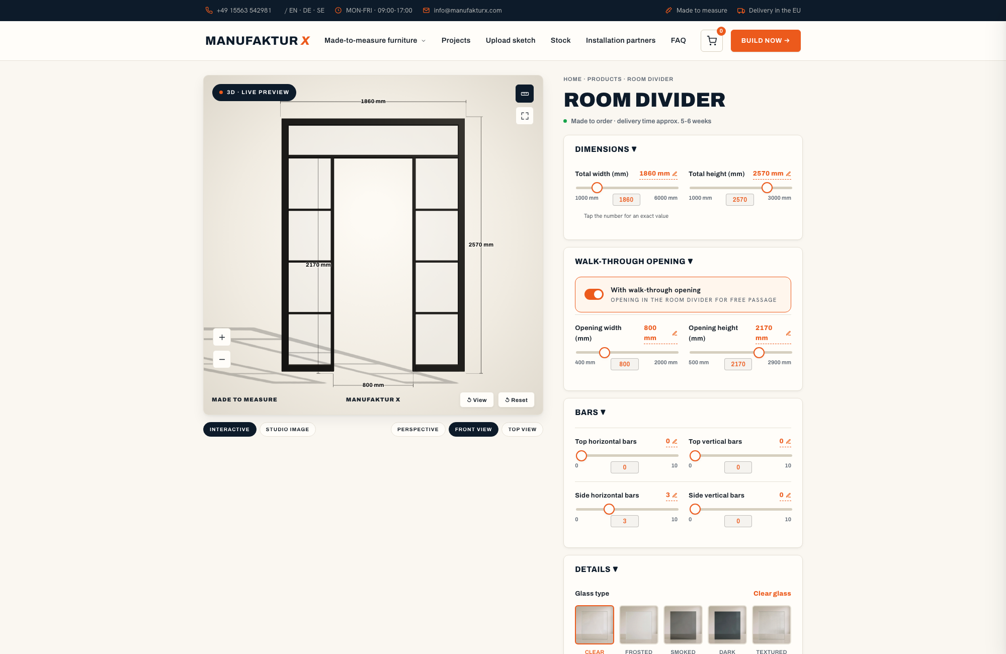
Glass features in the Manufaktur X range only on the custom loft door and the custom room divider. For these products, the choice between ESG and VSG is a safety and practical decision, not purely an aesthetic one.
- ESG (toughened safety glass): Breaks into small, blunt fragments rather than sharp shards - significantly safer than standard float glass. The standard choice for most loft door applications. Provides clear, undistorted views with minimal colour tint. ESG panels in our production are typically 6 mm or 8 mm thick.
- VSG (laminated safety glass): Two glass panes bonded by an interlayer film - when broken, the panel holds together and fragments do not fall. A sensible choice for doors in high-traffic areas, households with children, or where acoustic performance is a priority. Measured under equivalent thickness conditions, VSG reduces sound transmission more effectively than ESG.
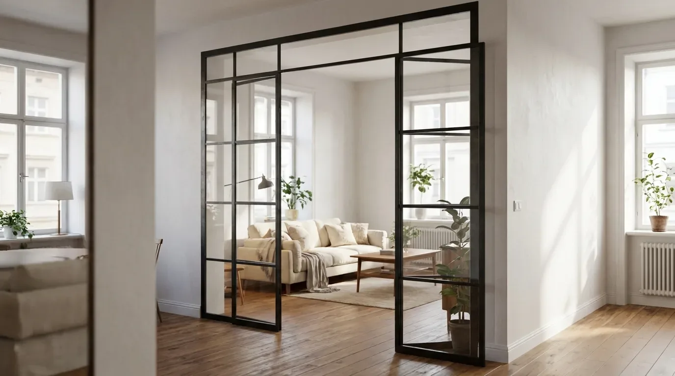
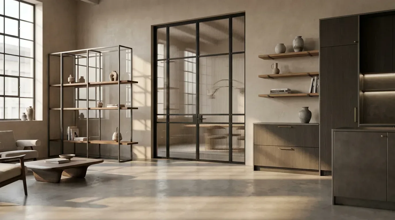
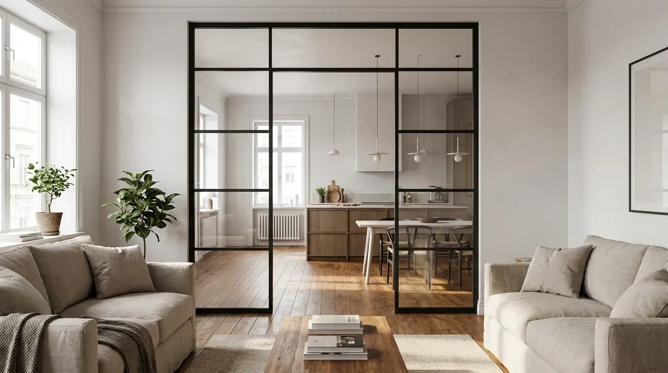
For colour perception in the room: clear glass lets colours and light pass through unaltered, while frosted glass (sandblasted or film-applied) scatters light and softens colour contrasts between adjoining spaces. In older apartment buildings - the kind of pre-war or inter-war period flats common across many European cities - where adjacent rooms are painted in very different tones, frosted glass can be an elegant way to avoid a jarring colour break at the door.
Contrast and Balance: How Many Materials Can One Room Handle?
A well-executed material palette depends on balanced contrasts:
- Rough surfaces alongside smooth ones
- Matte elements alongside reflective ones
- Warm materials alongside cool ones
Three to four primary materials per room is a well-tested upper limit. Adding more does not necessarily mean combining them badly - the problem is that the eye loses its reference point and cannot establish a hierarchy. In practical terms: if steel, oak, and exposed concrete already form three strong presences in a room, the fourth material (textile, stone, glass) should consciously step back and support rather than compete.
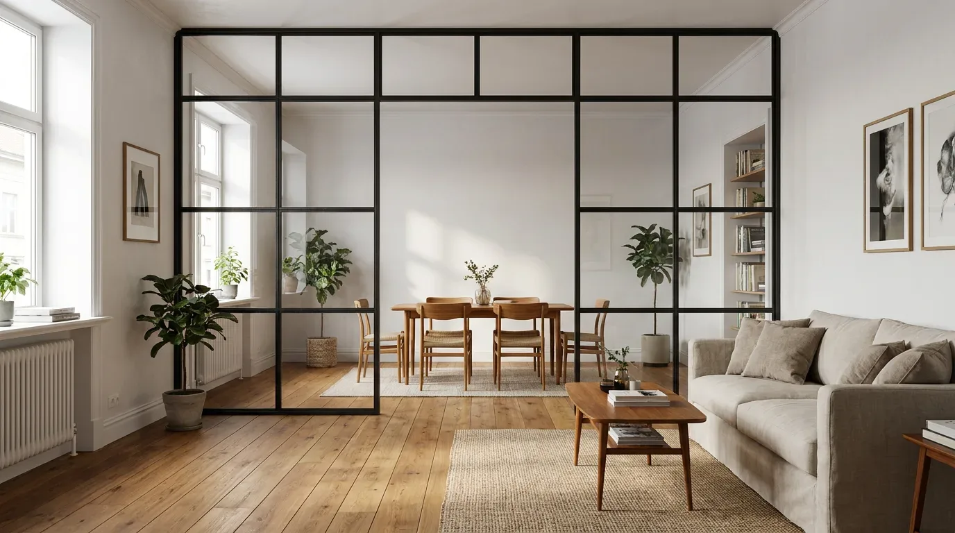
This is particularly relevant in open-plan layouts, which have become a standard feature in new-build apartments across Europe. When a living area, dining zone, and kitchen are all visible at once, a single consistent material theme - such as a repeated RAL tone across the loft door, the shelf, and the table frame - holds the space together far more effectively than matching wall colours in each zone.
How Light Changes the Way RAL Colours and Wood Tones Appear
North-facing rooms receive cooler, bluer light - RAL tones with a grey component (RAL 7016, RAL 9005) will read even cooler in these spaces. South-facing rooms receive warmer, more golden light, which amplifies the warm tones in oak and beech, while making cool grey RAL tones appear more lively.
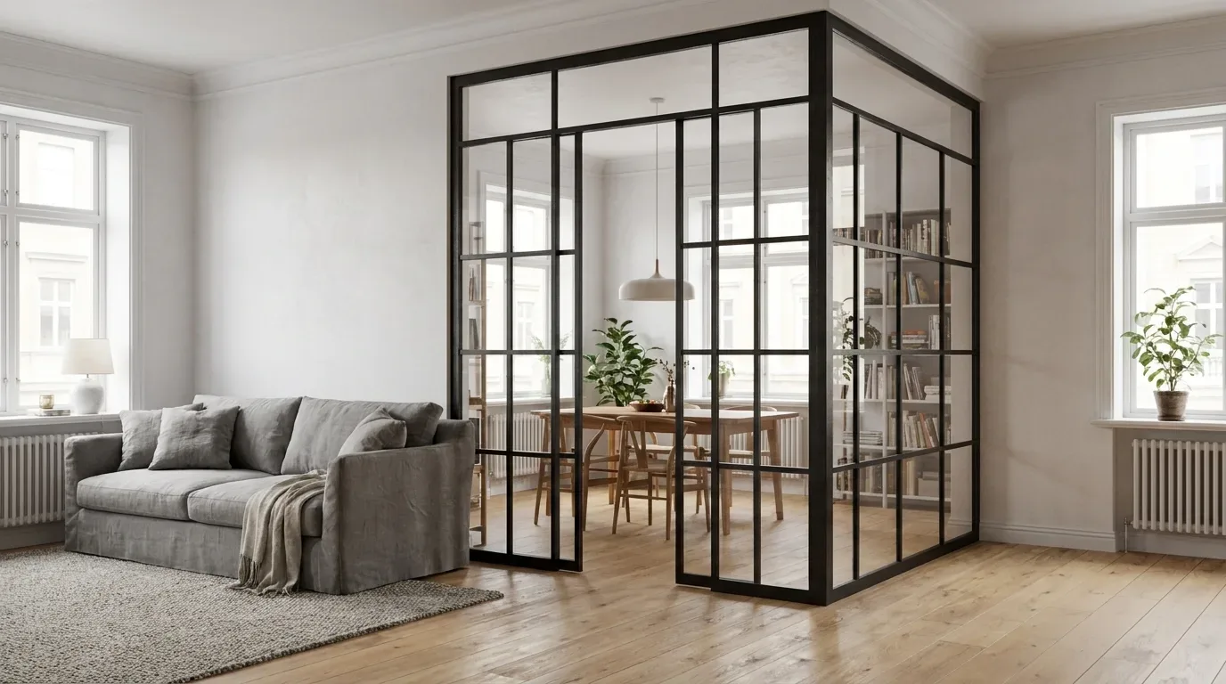
Artificial lighting has an equally strong effect. Warm white LED (below 3,000 Kelvin) emphasises wood warmth and softens the depth of dark steel tones. Neutral white (around 4,000 Kelvin) shows material colours most accurately. Daylight white (above 5,000 Kelvin) makes wood tones cooler and steel frames appear more contrastive.
A practical point from our production experience: always test RAL colour samples and wood samples under the actual lighting in your room - not in a shop or showroom. A combination that looks harmonious under fluorescent retail lighting can appear noticeably different under the warm white LED of a living room.
Colour Flow Between Rooms: Planning a Consistent Interior Across Spaces
It is worth thinking beyond individual rooms. A continuous colour concept with varied accents creates both cohesion and visual interest - especially in open-plan homes where three zones are often visible simultaneously.
Material repetition tends to be more effective than colour repetition: a steel frame in RAL 9005 that appears on the loft door, the shelf, and the dining table base connects spaces more powerfully than painting every room the same wall colour. The material becomes the through-line that gives the home its character.
Loft Doors and Room Dividers as Visual Connectors
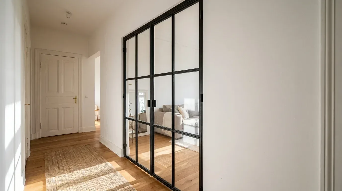
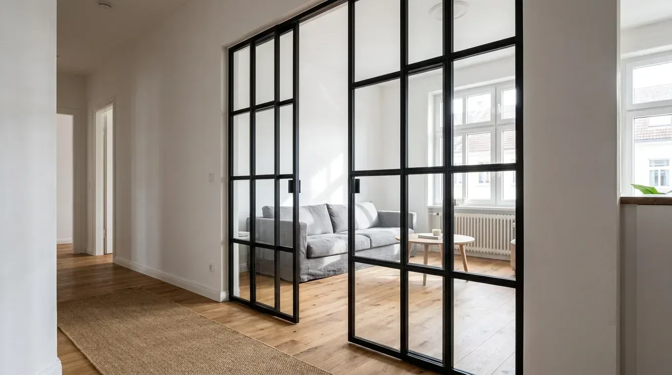
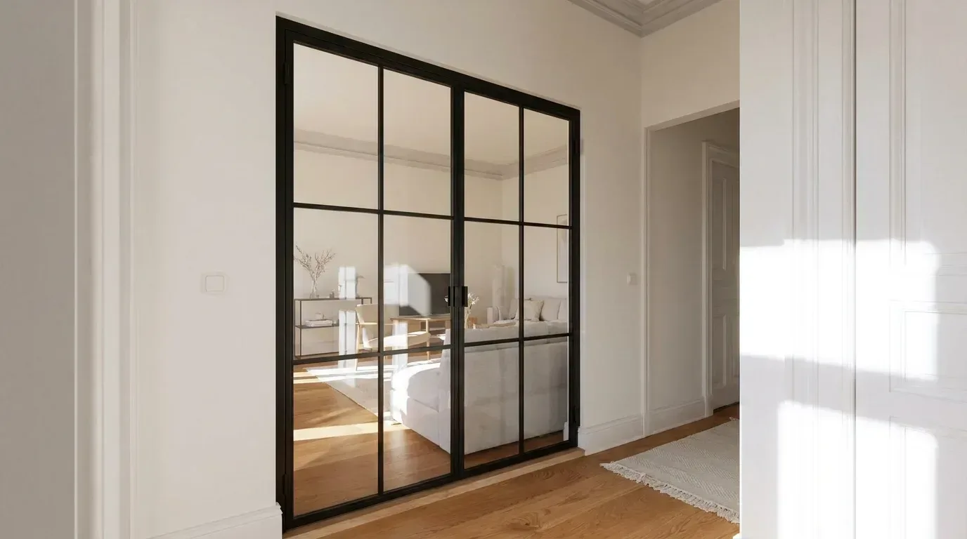
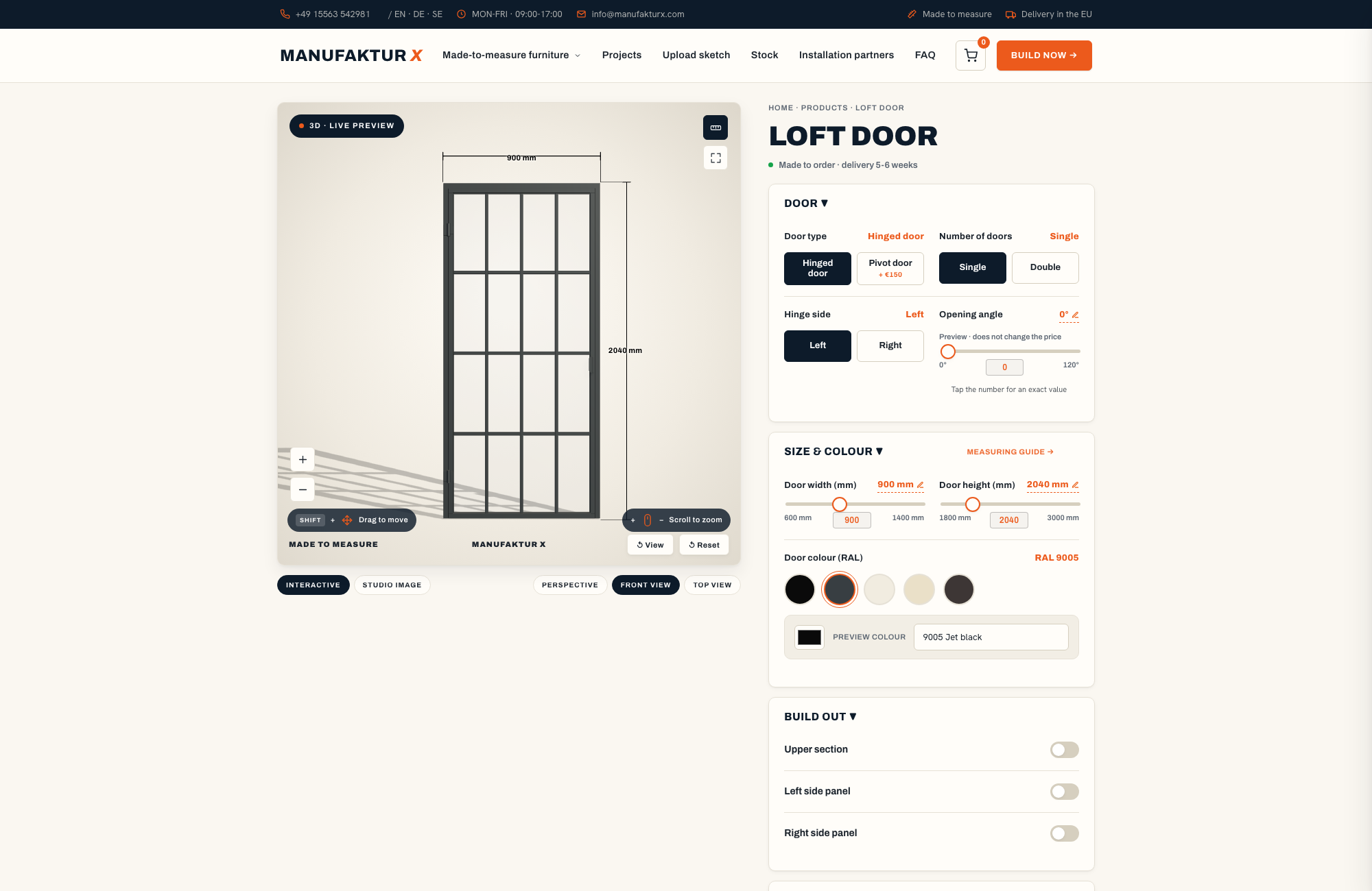
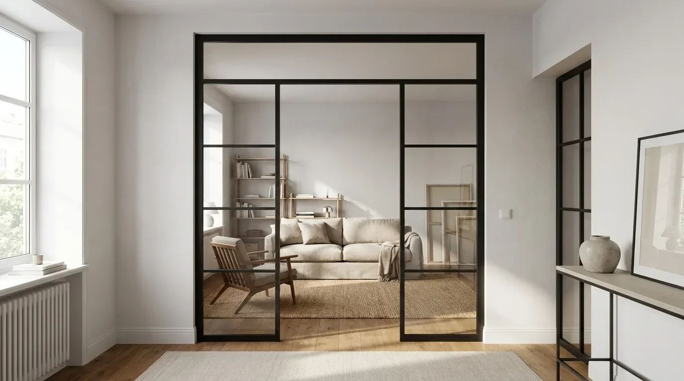
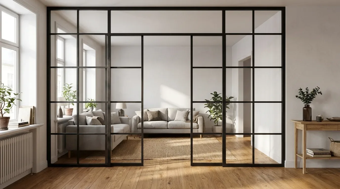
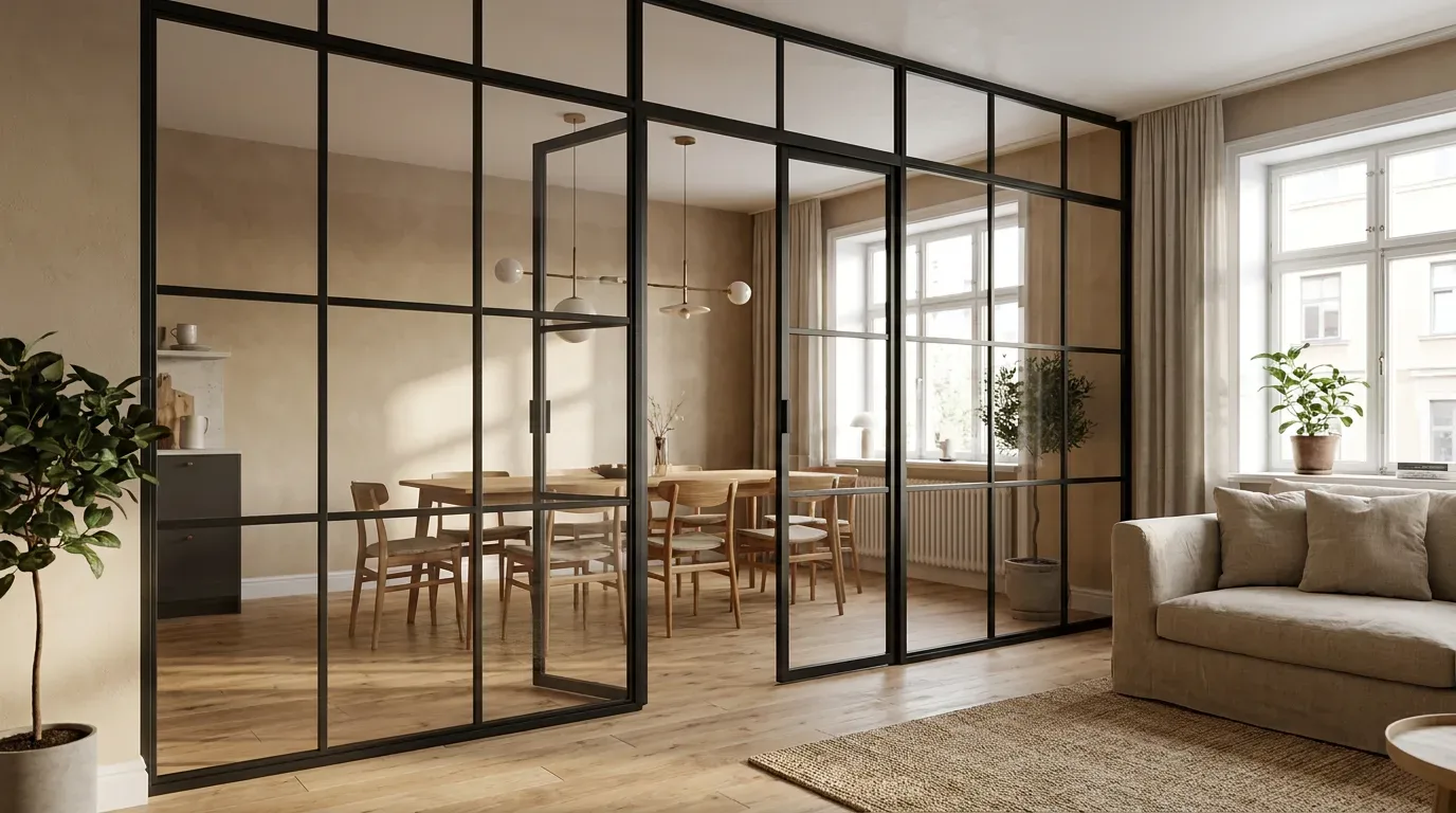
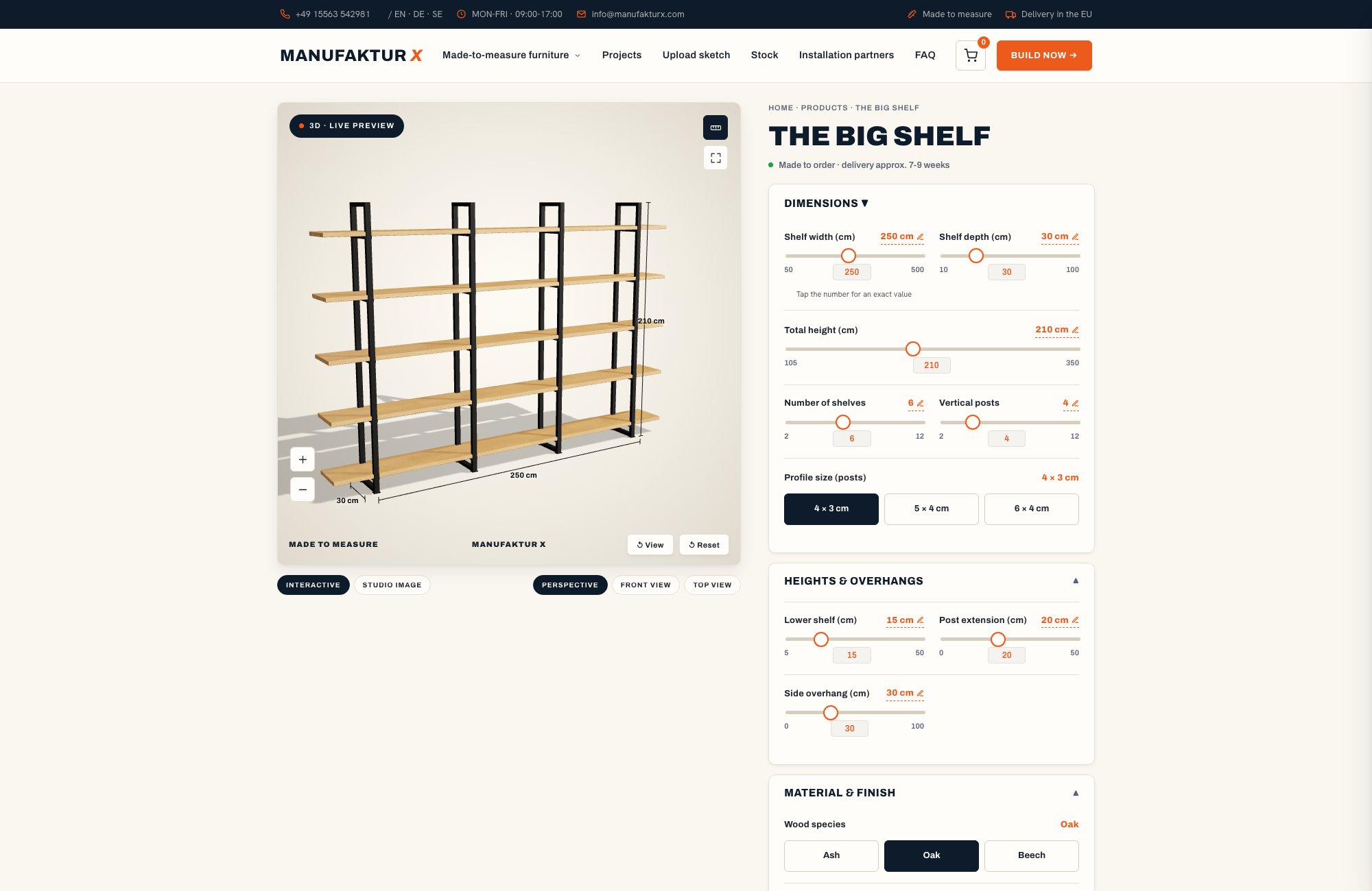
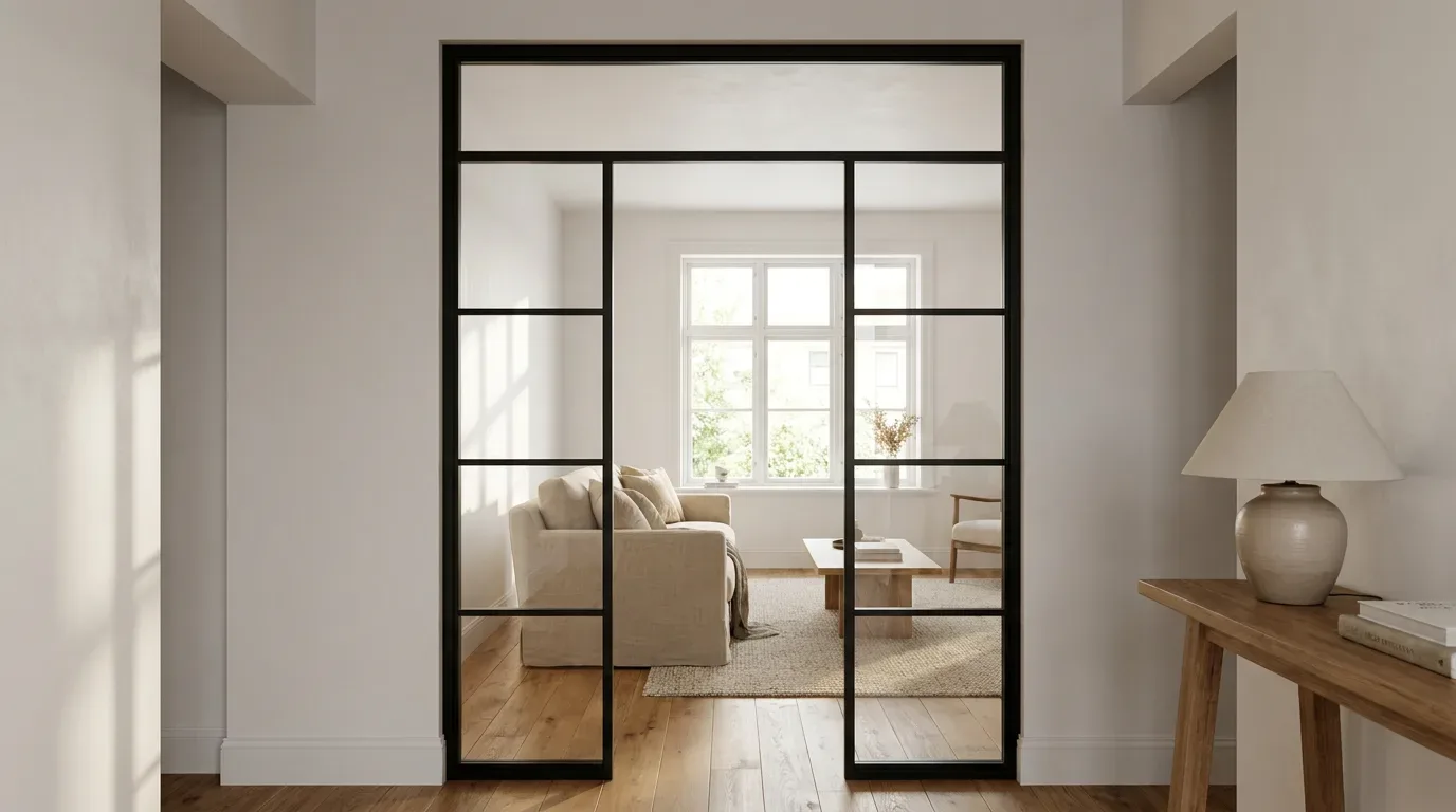
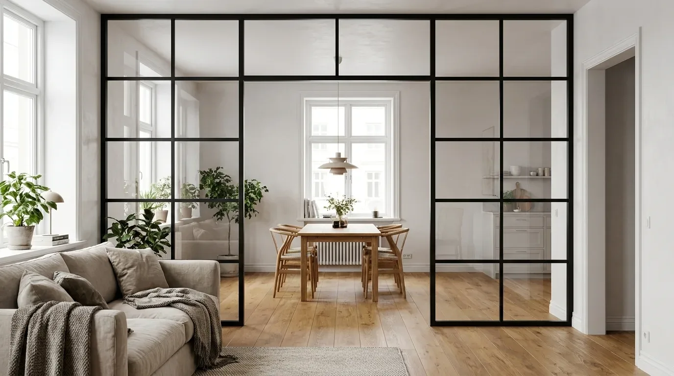
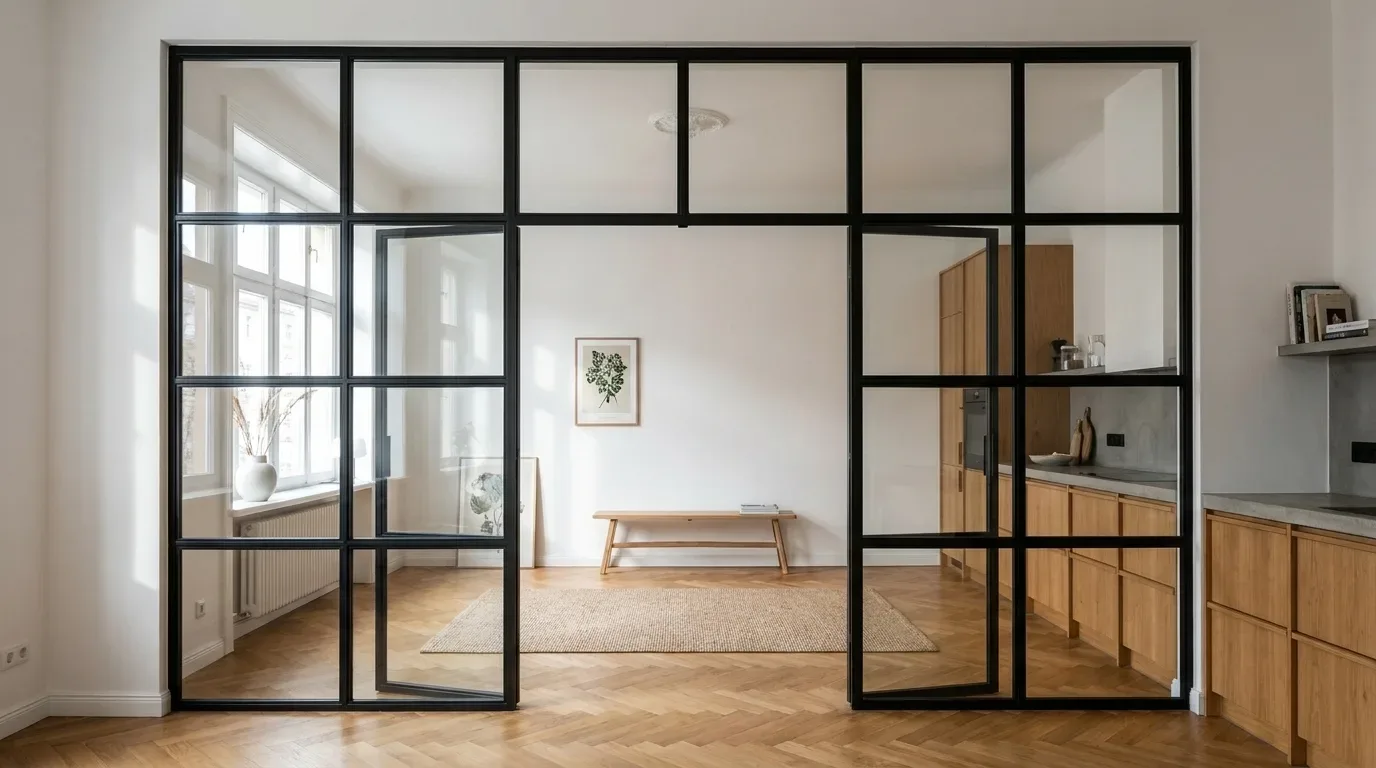
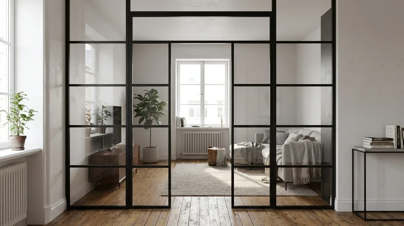
Where open space meets the need for privacy, steel-and-glass constructions serve a double function: they separate functionally while remaining visually open. A custom loft door can be matched to both adjoining rooms - the powder-coated frame picks up the tone of one wall while the glass keeps the sightline through to the other space.
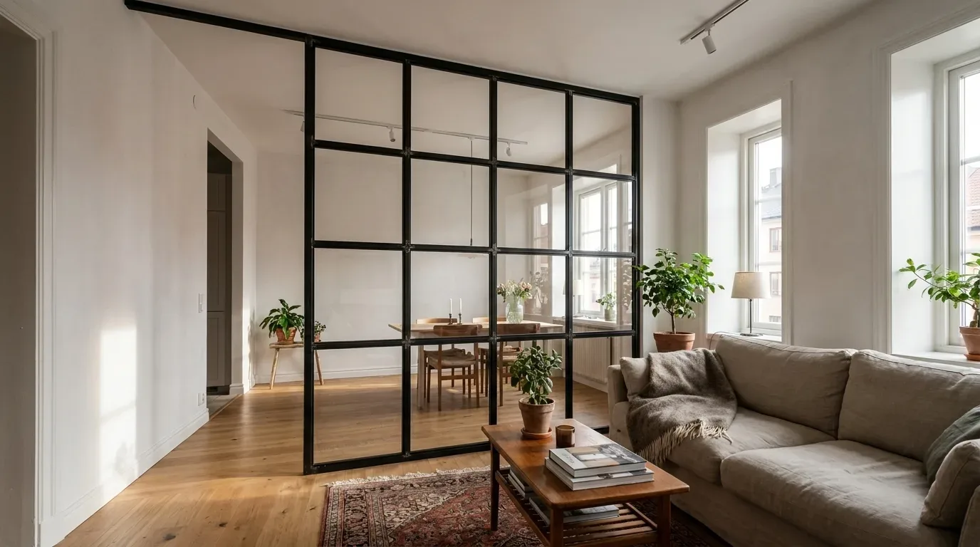
In period apartment buildings, where original floor plans rarely anticipated modern open-living preferences, we frequently find that customers initially view a loft door as a compromise - and after installation realise it actually defined the transition between spaces in a way that felt missing before.
Material Combinations for the Most Popular Interior Styles in 2026
Three interior directions currently dominate enquiries in our production, each with specific requirements for material coordination:
Industrial Style
Exposed brick or concrete surfaces, dark metal tones, and raw textures define this look. Steel frames in RAL 9005 or RAL 7021 (Black Grey) pair well with smoked oak or oiled ash. The important thing with industrial interiors: contrast is welcome - restraint is not the goal here. The harder the contrast between steel and wood, the more authentic the result.
Scandinavian Style
Light colours - white, pale grey, soft pastels - combined with natural materials and clean lines. Steel frames in RAL 9010 (Pure White) or RAL 9016 (Traffic White) alongside beech or light ash. The colour palette stays deliberately restrained; occasional accents in black or deep blue provide contrast without dominating. This style works particularly well in attic conversions with sloped ceilings, where lighter frames and pale wood keep the space feeling open.
Warm Modern
Earth tones, warm greys, and natural textures. Steel frames in RAL 7006 (Beige Grey) or RAL 1019 (Grey Beige) alongside oiled oak. This direction also tolerates unconventional accent colours - terracotta, olive green - as long as the wood surfaces remain neutral enough to anchor the palette.
Common Mistakes When Combining RAL, Wood, and Glass
In our experience, the most frequent planning problems do not arise during production - they originate in the decision-making phase before an order is placed. These are the mistakes we encounter most often:
- Choosing a RAL tone on screen without testing it in the room. Monitors cannot reproduce material depth. The result is that the steel frame arrives looking cooler or warmer than expected. Solution: request powder coating samples and evaluate them under your actual room lighting.
- Selecting a wood tone and RAL tone at the same brightness level. When the wood surface and the steel frame share a similar lightness value, the construction loses its visual definition. The piece reads as heavier than intended. Solution: plan for at least one clear step of brightness difference between frame and wood.
- Choosing glass type without considering the adjacent rooms. Clear glass between two very differently coloured spaces makes that colour contrast fully visible - which can be a deliberate choice, but is rarely a planned one. Solution: where there is a strong colour difference between rooms, consider frosted or textured glass.
- Introducing too many materials at once. Combining steel, oak, concrete, stone, and textile simultaneously removes the hierarchy the eye needs. No single material can assert itself, and the room feels restless. Solution: establish three primary materials, and let everything else support them.
- Forgetting that wood tone changes over time. Oak darkens under UV light - a frame in RAL 9005 that creates a strong contrast initially will settle into a quieter relationship with the wood after a few years as the surface deepens. This is not a problem, but it should not come as a surprise. Factor the long-term shift into your colour decision.
Measuring Accurately: What Really Matters for a Custom Fit
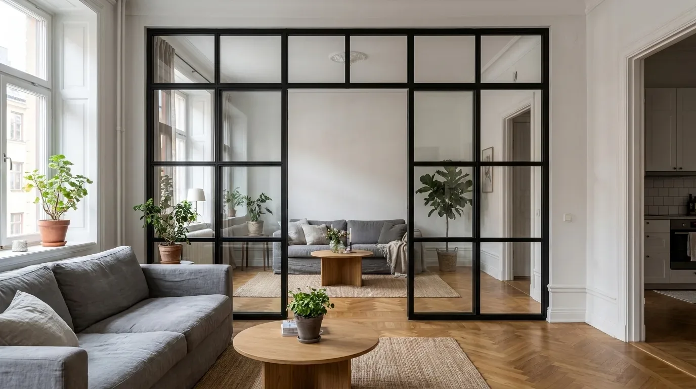
In roughly 70% of our loft door projects, customers measure different widths on the left and right sides of the opening - walls in older buildings rarely run exactly parallel. Taking a single measurement and using it as the order dimension produces a door that either binds on one side or leaves a visible gap.
The correct approach for measuring a loft door or room divider opening:
- Measure the clear width at three points: top, middle, and bottom. Use the smallest value.
- Measure the clear height at three points: left, centre, and right. Use the smallest value.
- Account for installation clearance: approximately 5 mm per side (10 mm total reduction in width).
- Check for skirting boards, radiators, and power sockets within the door's swing radius - the opening arc must be clear.
- Measure floor level variation across the width of the opening: differences greater than 3 mm require a customised bottom edge.
The most common reason a custom-made piece does not fit is inaccurate measurement, not a production fault. We see this regularly: customers measure from architectural drawings rather than the actual opening on site. Drawings show intended dimensions - the physical opening is what matters.
At Manufaktur X, customers enter their exact desired finished dimensions directly into the configurator - not the raw construction opening size. This is an important distinction: the configurator is designed for the dimension you want the product to be, and our production team works from there.
Custom-Made vs. Off-the-Shelf: An Honest Comparison
| Criterion | Standard Furniture (mass market) | Custom-Made - Manufaktur X |
|---|---|---|
| Availability | Immediate or short wait | 5-6 weeks production time |
| Dimensional accuracy | Fixed sizes, often not a precise fit | Millimetre-precise to your dimensions |
| Material choice | Limited; often particleboard | Solid wood (oak/beech/ash), powder-coated steel, ESG/VSG |
| RAL colour choice | None or very limited | Any RAL tone selectable |
| Price transparency | List price, rarely a real-time configurator | Fixed price calculated live in the online configurator |
| Manufacturing origin | Often outside the EU | Made in the EU |
| Repairability | Replacement parts rarely available | Individual components can be reordered |
A note on the comparison with mass-market furniture retailers: products from large flat-pack retailers such as IKEA offer genuine advantages in availability and price point - but fixed dimensions mean that a shelf designed for a 2.00 m ceiling will leave an unsatisfying gap in a room with a 2.65 m ceiling, or simply will not fit into a sloped attic space at all. Custom-made pieces are sized to the actual room from the outset.
Price Factors: What Determines the Cost of a Custom Piece
The fixed price for a Manufaktur X custom piece is calculated transparently in the online configurator, based on several factors:
- Format and dimensions: Larger surfaces require more material and production time.
- Wood species and surface finish: Oiled oak, lacquered beech, or stained ash each carry their own material value.
- RAL colour tone: Standard tones (RAL 9005, RAL 9010) are typically included without a surcharge; special tones may carry an additional cost.
- Glass type (loft doors and room dividers only): VSG involves a more complex manufacturing process than ESG and is priced accordingly.
- Hardware and opening mechanism: Pivot hinge or standard hinge, sliding mechanism or swing door.
| Product | Default configuration price | Note |
|---|---|---|
| Loft Door | 1,643 € | Steel and glass, default configuration 900 x 2040 mm |
| Room Divider | 2,212 € | Steel + laminated glass, custom width |
| Large Shelf | 3,200 € | Solid wood, steel frame, floor-to-ceiling |
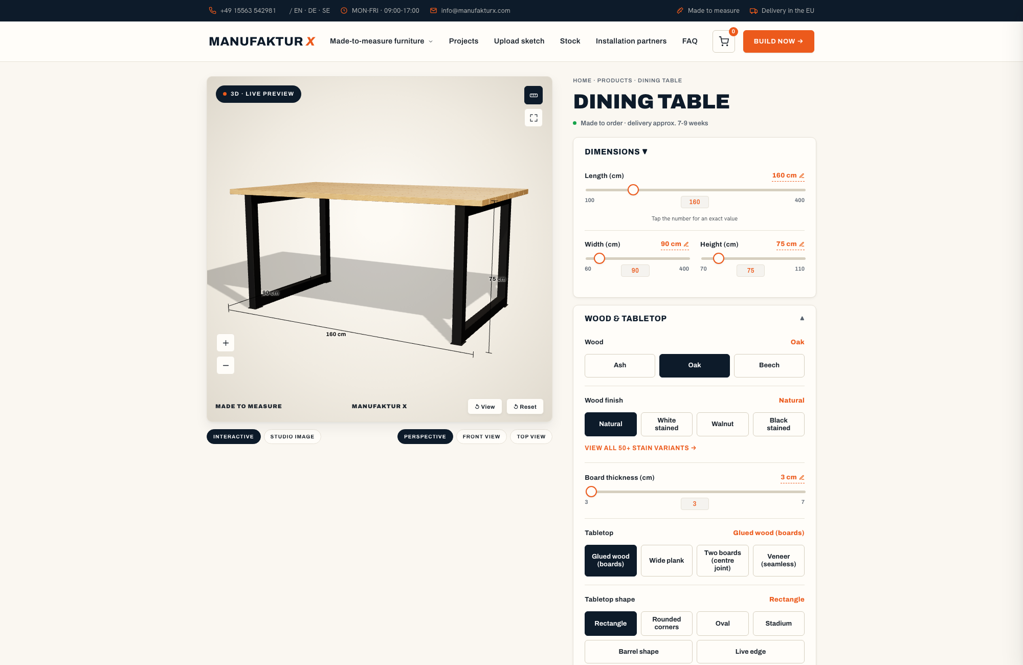
| Dining Table | 2,370 € | Solid wood, steel frame |
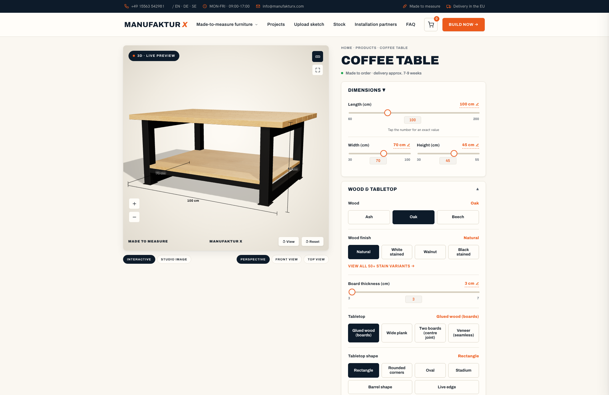
| Coffee Table | 1,800 € | Solid wood, steel frame |
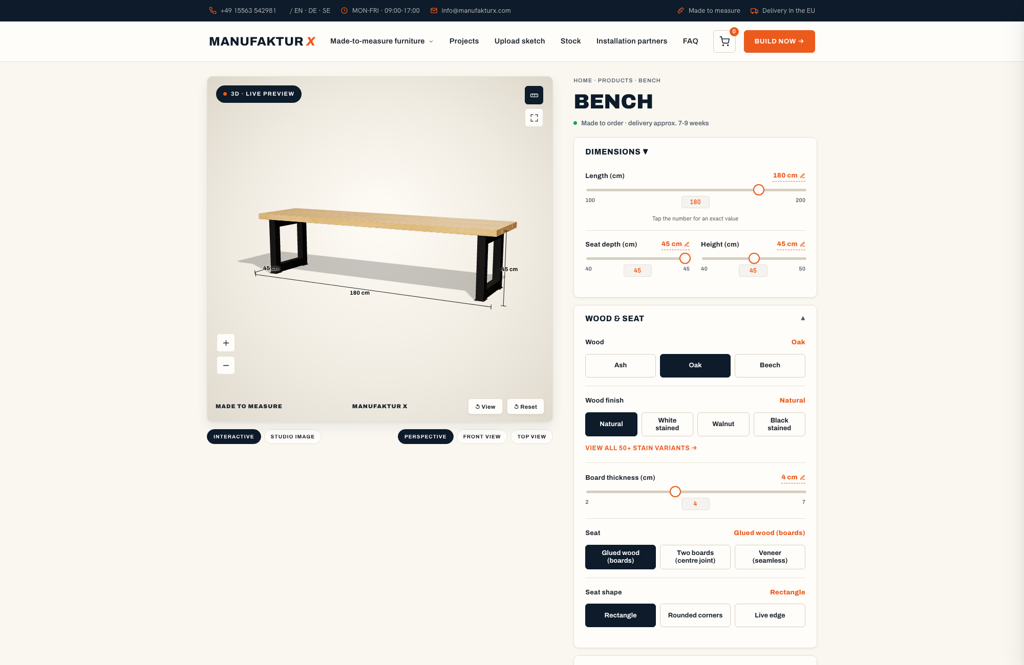
| Bench | 1,100 € | Solid wood, steel frame |
| TV Stand | 1,540 € | Solid wood, steel frame |
| Bedside Table | 995 € | Solid wood, steel frame |
| Hallway Wardrobe | 1,870 € | Solid wood, steel frame |
| Display Cabinet | 2,945 € | Solid wood, steel frame |
| Pipe Shelf | 1,065 € | Modular pipe shelf |
| Desk | 1,815 € | Solid wood, steel frame |
| Chest of Drawers | 5,040 € | Solid wood, steel frame |
The 3D Configurator: Matching Colours and Materials Before You Order
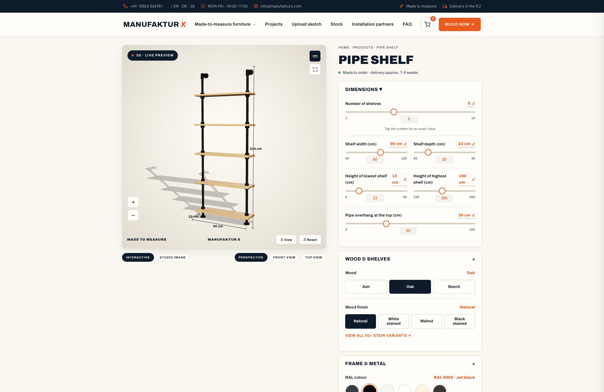
The 3D configurator at manufakturx.com renders the visual effect of your chosen materials in real time: RAL tone, wood species, surface finish, and dimensions are displayed immediately - and the fixed price updates in parallel. This significantly reduces surprises on delivery.
From our experience with the configurator: customers who test several RAL tones side by side choose a different colour from their initial instinct in around 60% of cases. The configurator makes this comparison possible without ordering physical samples or visiting a showroom - a genuine advantage for customers configuring from across Europe.
Steps in the configurator:
- Select your product (loft door, room divider, dining table, coffee table, bench, large shelf, pipe shelf)
- Enter your exact desired dimensions
- Choose wood species and surface finish
- Select RAL colour tone for the steel frame
- Choose glass type (loft door and room divider only)
- Read off the fixed price and save your configuration or proceed to order
Production and Delivery: What Happens After You Order
Once your order is confirmed, production begins at our EU facility. Every Manufaktur X piece goes through the same sequence of steps: steel frame cutting, welding, and grinding; powder coating; wood processing and surface finishing; glass cutting and sealing (loft doors and room dividers); assembly and quality inspection; and finally packaging and handover to the freight carrier.
Production time is 5-6 weeks from order confirmation. This timeline is a structural reality, not a variable that can be shortened. Compressing it would mean skipping production steps - which is not something we offer, because the quality of the finished piece depends on each stage being completed properly.
Before Installation: What to Check in Advance
Custom-made furniture arrives dimensionally precise - but the walls and floors it meets rarely are. Check the following before your delivery date:
- Wall construction: Solid masonry (brick, concrete) or lightweight partition? Lightweight walls require specific anchoring fixings that must be sourced separately.
- Floor covering: Is the loft door being installed over parquet, tiles, or carpet? The bottom seal needs to be matched to the floor surface.
- Sockets and switches within the swing arc: These are easy to overlook and often need to be relocated before installation, or the door opening direction needs to be adjusted.
- Radiators: A radiator sitting within the door's swing radius is a classic planning oversight - one that tends to become apparent only when the door arrives.
Colour Psychology: What Research Tells Us About Colours in the Home
Colours have measurable effects on mood and concentration. Blue tones are associated with calm and focus - an effect well documented in environmental psychology research. Yellow and orange bring energy into a space; green supports relaxation; grey reads as neutral and therefore versatile.
Applied to material choices: a steel frame in RAL 9005 (black) in a study or home office with blue wall tones reinforces the concentration-supporting quality of the space. The same frame in a dining room with warm earth tones can feel overly dominant - in that context, RAL 7006 (Beige Grey) would be the quieter, more appropriate choice.
Natural Materials and How They Age in the Room
Solid wood ages visibly - and that is an advantage, not a drawback. Oiled oak develops a patina over time that makes the wood appear deeper and warmer. A steel frame in RAL 9005 that initially creates a strong contrast will settle into a quieter relationship with the wood surface after a few years, as the oak darkens. Factoring this long-term shift into your colour decision leads to results that improve with time rather than simply holding steady.
Long-lasting materials - solid wood, powder-coated steel, ESG and VSG safety glass - need replacing less often. This is both an ecological and an aesthetic consideration: furniture planned for decades should be made of materials that can age alongside the room.
Room Acoustics: An Overlooked Dimension of Material Choice
Hard, smooth surfaces - glass, steel, polished concrete - reflect sound and can make rooms feel echo-prone. Soft textiles, textured walls, and natural materials absorb sound. VSG glass reduces sound transmission measurably more effectively than ESG of equivalent thickness - an argument for VSG in rooms with elevated noise levels that goes beyond pure safety considerations.
A balanced mix of sound-reflective and sound-absorbing materials creates not only visual harmony but also acoustic comfort. In open-plan spaces with a significant amount of steel and glass, we recommend introducing textile elements deliberately - curtains, rugs, upholstered seating - to reduce reverberation.
Timeless Colour Combinations as a Starting Point
Some material combinations have proven themselves over decades - not because they follow trends, but because they are built on contrast relationships that the eye reliably finds satisfying:
- Black (RAL 9005) with natural oiled oak - the industrial style classic
- Anthracite (RAL 7016) with smoked ash - a subdued, refined contrast
- Pure White (RAL 9010) with light beech - bright, airy, enduringly contemporary
- Grey Beige (RAL 1019) with natural beech - warm, unassuming, versatile
These combinations provide a reliable foundation. Personal accents - an unusual RAL tone, a grey or blue-toned wood stain - can be introduced confidently on top of this base, because the underlying structure is stable enough to carry them.
Seasonal Adjustments Without Replacing Your Furniture
Custom-made pieces in steel and solid wood are built to last - but the atmosphere of a room does not have to stay fixed. Interchangeable elements such as cushions, throws, curtains, and rugs allow seasonal colour accents without touching the core structure.
In spring and summer, fresh greens and soft blues as textile accents create a counterpoint to a dark steel frame. In autumn and winter, warm earth tones and textured fabrics amplify the warmth of the wood. The steel frame remains the constant, quiet anchor throughout - connecting seasons without itself needing to change.
Configure Your Combination Now: Colours and Materials in the 3D Configurator
Manufaktur X is a direct manufacturer with decades of experience in custom furniture production. All products are made to your exact specifications - dining table, coffee table, bench, large shelf, pipe shelf, loft door, and room divider. The online configurator at manufakturx.com displays your chosen RAL tone, wood species, and dimensions in real time and calculates a transparent fixed price instantly. EU-wide delivery is available across all markets.
Configure your custom furniture in the 3D configurator and get your fixed price instantlyFrequently Asked Questions
Can I change the RAL colour of my steel frame after delivery?
Recoating on site is technically possible but complex: powder coating requires oven temperatures that cannot be reached in a home or office environment. In practice, recoating means returning the frame to a production facility. For this reason, we strongly recommend evaluating your RAL tone carefully under your actual room lighting before ordering - powder coating samples are available on request.
Which wood species is the most low-maintenance in everyday use?
Lacquered beech offers the strongest resistance to moisture and staining. Oiled oak is easier to spot-repair when local damage occurs. Ash sits between the two: it is a hard wood (comparable to oak in density), takes stains well, and can be touched up in oiled form without full resurfacing. The choice depends on whether you prioritise protection (lacquer) or ease of local repair (oil).
What should I do if my wall is not straight?
For irregularities greater than 5 mm across the width of the opening, we recommend noting this in the configurator or contacting us before placing your order. In these cases, the bottom edge of the door can be profiled to follow the floor, or a cover strip can be produced to bridge the gap - both are achievable with a custom-made piece, and neither is possible with a standard off-the-shelf product.
Is VSG glass required for a loft door?
No. ESG meets the requirements for safety glass and is sufficient for the majority of loft door applications. VSG becomes the better choice when acoustic performance is a priority, when there are children in the household, or when the door is installed in a high-traffic area where the risk of impact is elevated.
Can I order multiple products in the same RAL tone for a consistent look throughout my home?
Yes - and this is one of the most frequent requests we receive. The loft door, room divider, dining table, and large shelf can each be configured with the same RAL tone in the configurator. Because all products are produced in the same facility using the same powder coating process, colour consistency between pieces is guaranteed.