The Art of Visual Balance in Home Design
Walking into a perfectly designed space feels like stepping into a symphony where every element plays its part in perfect harmony. This magical feeling isn't reserved for spaces designed by professional interior architects - with the right understanding of color relationships and material combinations, anyone can create this sense of visual balance in their home.
The secret lies in understanding how different elements interact with each other. When colors complement rather than compete, and when materials create dialogue instead of discord, your living space transforms from merely functional to genuinely inspiring.
Understanding Color Relationships
Color harmony operates on scientific principles that anyone can master. Think of it as learning a visual language with its own grammar and vocabulary:
- Single-color schemes: Working with different shades and tones of one primary color
- Adjacent harmonies: Colors that sit next to each other on the color wheel
- Opposite attractions: Complementary colors that create dynamic contrast
- Triple balance: Three evenly spaced colors forming a triangle on the color wheel
Professional designers often rely on the classic proportion formula: 60% dominant color, 30% supporting tone, and 10% accent color. This mathematical approach ensures visual balance without overwhelming the senses.
Material Selection and Texture Combinations
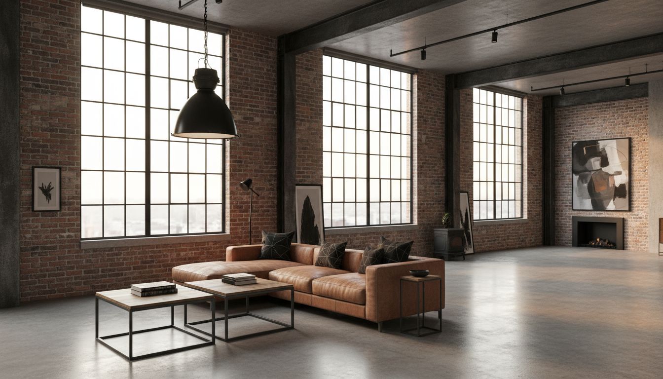
Beyond color, the tactile quality of materials adds another layer of sophistication to your design. Each material speaks its own language: solid wood whispers warmth and tradition, steel declares strength and modernity, while safety glass brings lightness and transparency to any composition.
The key is creating meaningful conversations between contrasting textures: smooth surfaces paired with rough ones, matte finishes balanced against glossy elements, warm materials complementing cool ones. However, restraint is crucial - limiting yourself to three or four primary materials per room prevents visual chaos.
Strategic Use of Architectural Elements
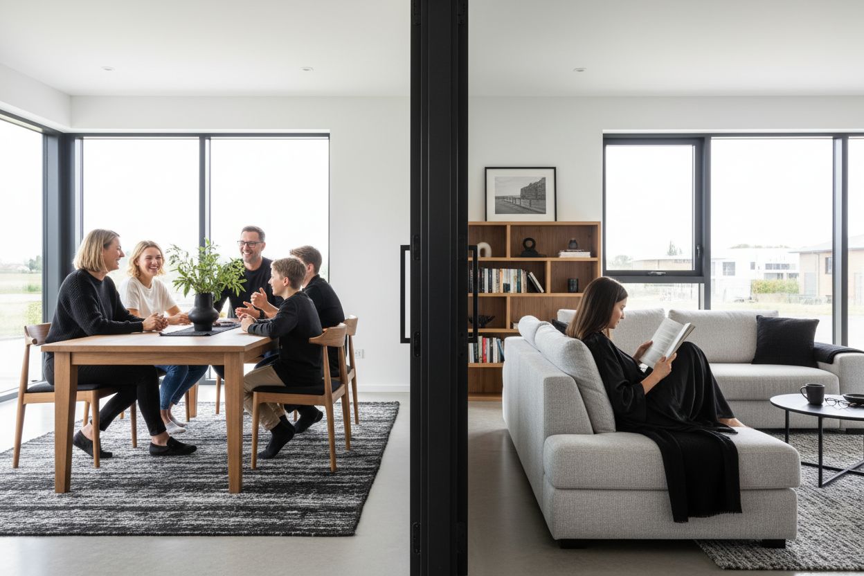
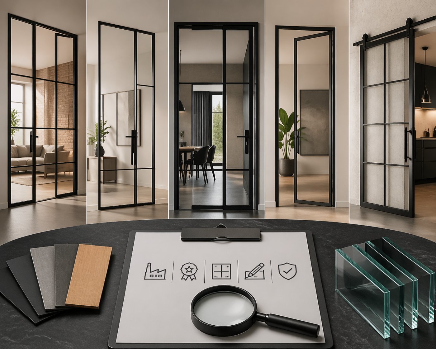
Room dividers serve as both functional and aesthetic anchors in open-plan living. A well-chosen loft door can bridge two spaces while maintaining the color flow between them. The transparency of glass panels allows light to travel freely, influencing how colors appear throughout connected areas.
When selecting architectural elements, consider how powder-coated frames integrate with your existing palette. The scratch-resistant finish of powder coating not only ensures durability but provides consistent color saturation that won't fade or chip over time.
Lighting's Impact on Color Perception
Natural light changes throughout the day, dramatically affecting how we perceive colors. Northern exposure tends toward cooler tones, while southern light brings warmth. Before committing to any color scheme, observe how your chosen palette behaves under different lighting conditions.
Artificial lighting adds another variable to the equation. Test your material samples under various light sources to avoid surprises. What appears perfect in the showroom might look completely different in your home environment.
Creating Flow Between Spaces
Modern homes often feature open-plan layouts where spaces blend seamlessly into one another. Creating visual continuity while maintaining distinct zones requires careful planning. A consistent color thread running through different areas, punctuated by varying accent colors, maintains cohesion without monotony.
Custom furniture pieces, such as those available through ManufakturX, can be precisely matched to your color scheme. The ability to specify exact dimensions and finishes means each piece integrates perfectly with your overall design vision, produced with EU quality standards and delivered within 5-6 weeks.
Timeless Color Combinations That Work
Certain color partnerships have proven their staying power across decades of design trends:
- Navy and cream for sophisticated coastal elegance
- Charcoal and gold for contemporary luxury
- Forest green and natural oak for organic warmth
- Pure white and black for architectural drama
These proven combinations provide a solid foundation that you can personalize with unique accent pieces and textures.
Psychological Effects of Color in Living Spaces
Colors influence our emotional state more profoundly than many realize. Cool blues promote concentration and calm - ideal for work areas or bedrooms. Energetic yellows and oranges stimulate appetite and conversation in dining spaces. Earth-toned greens connect us with nature, promoting relaxation in living areas.
Consider the primary function of each room when developing your color strategy. A dining table in warm walnut might anchor a social space, while cool steel and glass elements work better in focused work environments.
Adapting Harmony to Different Design Styles
Contemporary minimalism thrives on neutral palettes with occasional bold accents. Industrial aesthetics embrace raw materials like exposed steel and concrete, where black powder-coated frames create striking focal points. Bohemian styles welcome adventurous color mixing, balanced by neutral foundation elements.
Seasonal Flexibility in Design
Your color harmony doesn't need to remain static year-round. Strategic use of changeable elements - textiles, artwork, decorative objects - allows you to shift the mood seasonally without major renovation. Light, fresh tones for spring and summer give way to richer, warmer palettes during autumn and winter months.
Small Space Color Strategies
Compact rooms require special consideration when applying color harmony principles. Light, cool colors create an illusion of spaciousness, while unified color schemes reduce visual clutter. Reflective surfaces and transparent elements, like glass-paneled room dividers, maintain openness while providing functional separation.
Sustainable Materials for Lasting Beauty
Choosing materials that age gracefully ensures your color harmony improves over time. Natural materials like solid oak, ash, or walnut develop rich patina that adds character. High-quality finishes like powder coating maintain their appearance for decades, making them both environmentally responsible and economically sensible choices.
Professional Tools for Planning Success
Start your design journey with a mood board combining color samples, material specimens, and inspiration images. Test small areas before committing to large-scale changes - a single accent wall reveals more than any sample can predict.
Modern 3D configurators allow you to visualize custom pieces in your space before ordering. This technology eliminates guesswork, ensuring your new furniture integrates seamlessly with your existing color palette.
Remember that personal preference ultimately trumps design rules. The most successful color and material harmony is one that makes you feel completely at home in your space.